Pages

Sunday, August 12, 2018

Kre8tors Blog Hop - Water


It's blog hop time again! This time with the Kre8tors group! You probably just arrived from Rebecca-Jo Unwin. Did you just love what she did with this month's theme?

As you guessed it, this month's theme is water. AHHHH! I love this month's theme! I LOVE ANYTHING that has to do with water!! And I knew immediately I wanted to use the Magical Mermaid stamp set, as I've had it for a quite a while but haven't had a chance to use it.

I'd like to say I came up with this card on my own, but I actually used the annual catalog for inspiration. Look at page 152 and you'll see something familiar! Although I did put my own spin on it, I kept it close to what the talented concept artists at Stampin' Up! originally designed.


First step... color and fussy-cut the mermaid. I do love fussy-cutting! 


Next, use a stylus (I grabbed the one from my score board) and rub it on the back of the mermaid, which is on the piercing mat. This gives the mermaid a bit of dimension (see below).


Next, sponge the background using the sponge brayer and a few different inks, blending them together. Neatness and perfection do not count... think whimsical.


And now for a little texture...


And finally, the finished project!


I hope you enjoyed today's project! Now hop on over to Jo Blackman! If you get lost along the way or want to go back and see a specific project/blog again, you can always use the list below to find your way.

Have a hoppy day!
 photo Sig-Diana - original resized_zps4ta32dll.png


August 2018 Kre8tors Blog Hop Roll Call
Diana Tillery --> You are here!

Wednesday, August 8, 2018

Let's Get Hopping - Favorite Technique


You have just hopped over from the sweet and talented Nina McMillan. I always love her projects!!

In case you're starting here, the theme for this month's hop is My Favorite Technique. I have to say... my favorite technique has always been - and will always be heat embossing - it's the reason I fell in love with cardmaking. But... it's hard to show just how amazing it is to have a raised image on a piece of paper when looking at a picture on a computer (or phone), so I decided to go with my second favorite: watercoloring. Why is watercoloring my favorite? Because it is SO relaxing! You know me... I love quick and easy cards, but when I actually have time to sit down and do something "not so quick," I turn to watercoloring. In fact, I decided to take the time to make two cards using two different watercoloring techniques - just watercoloring and (new-to-me) no-line watercoloring.

What's the difference? Just look!


The above card is watercolored. I stamped the outline with Soft Suede and used ink and an aqua painter on shimmery white cardstock - which is nice and heavy and can withstand water saturation. The Designer Series Paper is from Garden Impressions. I think it adds such a nice touch behind the watercolored truck. Who knew such a beautiful paper could be used on a handsome card? (wink)


This card uses the same tools, colors, and technique... except you may notice the colors look a bit more muddled or muted. This is because the line disappears when it's watercolored - hence the name no-line watercoloring. To achieve this effect, just stamp off your outline image twice before stamping on your shimmery white cardstock.

Pretty cool, right? I love that they are SO different! And of course, I had to change each slightly and chose different ribbons for each card. I also decided to not have a greeting... it's not often I design a masculine card, so I wanted to be able to add a sentiment for a specific occasion - when it happens.

Which version do you like best? Leave me a comment and let me know.

Thanks for stopping by! Now hop on over to my creative friend Tracy Bish and see what she's created with her favorite technique.

 photo Sig-Diana - original resized_zps4ta32dll.png


Tuesday, July 24, 2018

Making My Way to a Major Milestone

Do you set goals for yourself? I usually don't, but 2018 started out to be a year of wonder for me, so I decided it was time to jot down some plans for my Stampin' Up! business... and here's what goals I set for myself:


I've been a demonstrator for 13 years and I've done things this year I've only thought about in the past, but never had the guts to do. There is, however, one thing I actually never dreamed was possible when I signed up to be a demonstrator in 2005 (remember, I joined for the discount) but it now seems to be within reach: achieving $100,000 in career sales. It's certainly not as glamorous as being a Million Dollar Achiever, but to me, it's just as huge! My goal for 2018 isn't to make this happen... because I know it will. My goal is to make this happen by October so I can celebrate at OnStage in November (convention for Stampin' Up! demonstrators) during our 30th Anniversary celebration!

To help me achieve this goal, I'm reaching out to you. Stampin' Up! has an amazing promotion going right now - if you buy 3 packages of select Designer Series Paper, you receive 1 of your choice FREE! These papers are AMAZING!


Our Designer Series Papers aren't represented well in the catalog (in my opinion), so be sure to check out the video below to see just how pretty they are (they should be seen in person to really appreciate their beauty)!


To sweeten the deal, if you participate in this promotion and purchase 6 packages, I will gift you a bonus package of Designer Series Paper! So basically... you purchase 6 packages and receive 3 FREE! Make sure you're shopping from the list above (bonus from me will be shipped after August 1. Also, if ordering online, please use host code 3MJ3EPQV.


Can you tell I really want to hit that milestone soon? There's only one week left in this promotion, so be sure you place your order by July 31. And be sure you don't click the "no contact" box... if you do, I won't know you ordered, and I won't know where to send your free package of Designer Series Paper!


As of today, I am only $3,829.33 away from my milestone! If you're not interested in participating in the Designer Series Paper promotion, but you still want to help me reach my goal, I appreciate orders of any size and if you place an order with me, I may just send you a small token of my appreciation!

Gratefully,

Sunday, July 8, 2018

Kre8tors Blog Hop - Creating with a Card Sketch


Hello! And welcome to July's Kre8tors Blog Hop! If you're not starting here, you've likely hopped over from the creative Jacqui Lawrence.

This months' theme is a card sketch challenge. I love card sketches! When I am lost in the creative cloud and don't know where to begin, I turn to a sketch. I jump on Pinterest or pull out an old card (anything would work) and follow that format. My project may go in a totally different direction - and usually does (I encourage that when I post card-sketch challenges for my team in our Facebook group). Today, however, I'm sticking close to this sketch (or at least... as close as possible).


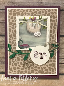
When I saw this sketch, I knew immediately I wanted to use items from the Animal Expedition Suite, so I grabbed pretty much everything I had on page 27 of the annual catalog. I decided Rich Razzleberry suited my card a little more than the suggested coordinating color Berry Burst. One of my favorite elements of the paper is the sloth hanging from the tree branch, so that had to be included. OMGosh SO CUTE! Honestly... it reminds me of my brother - his nickname is Sloth - and he's proud of it. LOL!

There was very little stamping, a little more fussy cutting, some die-cutting, and some ribbon-winding. But it came together fairly easily. It's always easy when you have a sketch to follow and more or less of a picture in your mind.

And THIS is what all of that morphed into!


As you can see, I did take some liberties with this sketch. I changed elements C and D and turned them into "ribbon" elements. Also, we were told we could change the shape of element E... so I did. I also added the thin layer of white behind the giraffe designer series paper - because it felt like it needed something to tie in the white frame and sentiment.

And by the way... the background behind the sloth? That's vellum cardstock covering a piece from the Tranquil Textures Designer Series Paper. It gave the sloth and his little reptilian friend the perfect backdrop! The complete list of supplies is (as always) at the bottom of this post (after the blog hop roll call). Oh, and if you didn't already know... some of the designer series paper is Buy 3, Get 1 Free! BUT if you order 6 from me using the host code below, you get 3 FREE! This is an offer only through me - and only until July 21 (complete details with host code below).

Thank you for stopping by to see how this month's challenge has inspired me. Now hop on over to Laura Mackie and see what she's created from the sketch! If you get lost along the way, or missed someone's blog, our roll call is below the "next" button.

Happy hopping!


Stampin' Up! may be giving you 1 package free for every three, but if you order 6 packages of Designer Series Paper, I will give you a bonus pack FREE!! Here's how it works:

  • Order using host code XKHSZSFA by July 21
  • Other items may be added to your order, but all 8 packages of Designer Series Paper must be on the same order (6 plus 2 free) and be from the list above
  • After placing your order, email me your order confirmation (be sure your name and shipping address are shown)
  • Bonus free package of Designer Series Paper will be shipped to you on or before August 1


Diana Tillery --> You are here!

Want to create my card at home? Here's what you'll need...

Big Shot
$110.00
Glue Dots
$5.25